Deriving layout from your typeface
I like to start with type when exploring the aesthetics of a project. From there, layout and other design considerations can take their cues from the content itself. But how does a type-centered approach to layout look on the web? And how does such a process work with the fluidity of the web to produce unique, engaging compositions at any viewport size?
To explore these questions, I’ll walk through my process for building fluid compositions that reflect the characteristics of a typeface, using three exceptional web fonts from Typekit as examples: DIN Condensed Web, JAF Herb, and Chaparral Pro.
Note: on each layout you can hit Cmd + G in OSX, or Ctrl + G in Windows to see an overlay of the grid system.
 View the layout, and the grid system.
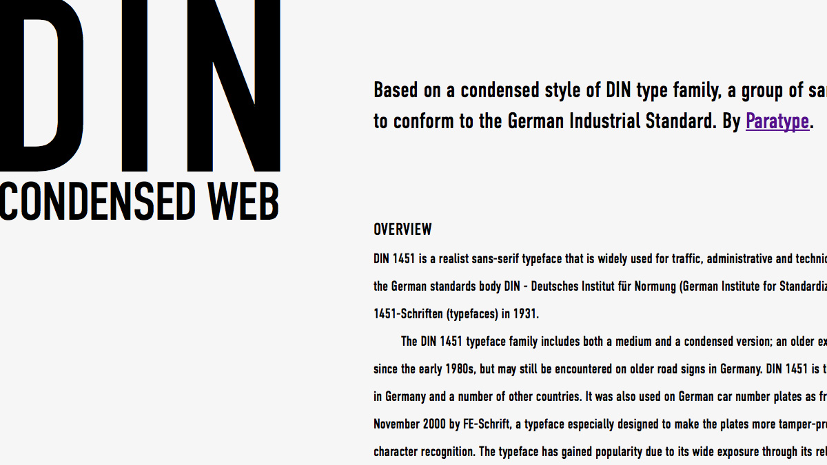
DIN Condensed Web
The first incarnations of DIN were originally designed in 1931 for the Deutsches Institut für Normung, the German standards organization. DIN 1451 was most famously used on German road signage for decades, and in the 90s it gained a broader popularity due to being one of the first quality sans-serifs released in the PostScript format. DIN Condensed Web, cut by ParaType and delivered through Typekit, again deftly adapts these classic letterforms for a new context.
The type
Given the heaviness of DIN, I had to set a base font size of 20px to make it readable for copy, and gave it a generous line-height. The historical relationship to “standards” made me think of uniformity and simple mathematics, so to honor this, I kept the the size and spacing of the text to increments of 0.5em. The lead-in text is 1.5em, while the body copy is 1em. Margins are set in whole ems as well.
The one exception is the headline, “DIN Condensed Web”, which I set with the viewport width (vw) unit. I tweaked this font size at various viewport widths to align it with the grid, rather than using ems to relate it to the other font sizes. I felt this created a stronger connection between type and layout.
The grid system
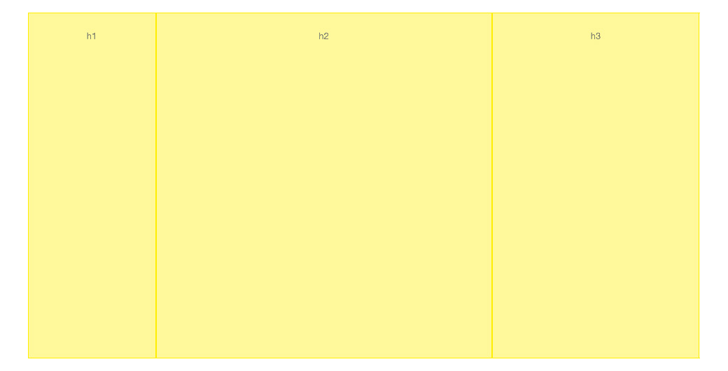
In consideration of DIN’s historical relationship to standardization, I knew I wanted to build this layout on one uniform grid, which necessitates more columns to inject variety into the composition. To me, this sounded like a standard we’ve had in the web industry for a while: the 12-column grid. But to make it interesting, I ditched any gutters so the basic unit of the grid, the column, is given more exposure in the layout.
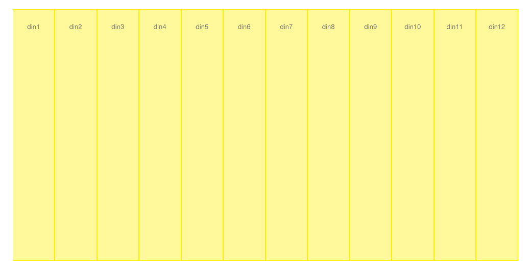 12 column grid, no gutters
The layout
I tried to build a composition that was dynamic and felt as bold as the typeface itself. Starting with a comfortable, mid-sized viewport (around 1200px wide), I tried to push DIN into a more radical tone, with asymmetry and interesting whitespace.
Layout decisions came directly from the needs of the content. For example, the “Overview” section is thinner and shorter, allowing the deeper “History” content on the right more space. The margins above and below the lead-in copy are echoes of grid column widths, exploiting how top and bottom margins in CSS are based on the width (not height) of the page. Once I felt the composition was working at one size, I then started looking at various sizes by resizing my browser window, adapting the layout where it started to feel pinched or stretched. Later, in my testing phase, I fine-tuned the layouts on real devices.
 View the layout, and the grid system.
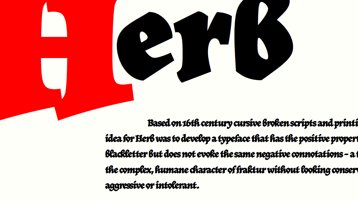
JAF Herb
I truly respect what Just Another Foundry has accomplished with Herb. A throwback (way back) to the broken scripts of 16th-century Europe, Herb is not derived from frakturs as it may first appear, but instead is uniquely inspired by gothic cursives of that era. By blending blackletter qualities with roman forms, Herb is at once historic, fresh, and surprisingly readable.
The type
The aesthetic power of proportions, such as the Golden Ratio, shaped design in the 16th century — both in architecture and print. Book dimensions have not veered far from this proportion since the mid-16th century, and I found even the proportions of Herb’s thin and thick strokes fall close to (if not right at) 1:1.618. For me, this seems like a logical way to tie together the characters, layout, and history of this typeface, so every font-size, padding, and margin value is derived from this ratio.
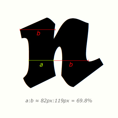
The thin to thick proportions are roughly 1:1.618
The line-height of the copy is set to 1.618, providing ample space between the heavyset lines of text, and margins and paddings are set to either 1em or 1.618em. The large drop cap is 1.618em of the heading’s font size, which is set to 25vw to align with the grid.
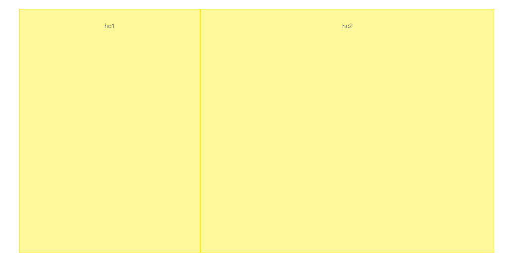
The grid system
Building up from the type, the grid system is also derived from the Golden Ratio, with the viewport size determining which grid to swap in. On viewports larger than 960px, the main layout grid comprises three columns, each 161.8% larger than the last. The largest column is used for the main text body, while the two columns on either side provide a cohesive asymmetry. The outer padding, applied to the body, is 61.8% of the smallest column in the layout grid, again pulling from my chosen ratio.
 Layout grid for mid-ranged viewports, based on the golden ratio
Within the main body of text, modular content grids are used to set margins and to place the block quote on viewports larger than 530px.
 Content grid for mid-ranged viewports, based on the golden ratio
The layout
By using an asymmetrical grid for larger layouts, I wanted to emulate the feel of a right-facing page from one of the Renaissance books that inspired this typeface and design. I pushed the Golden Ratio to tie the layout together as it expands and contracts on different viewports, showcasing the durability and character of Herb at all sizes.
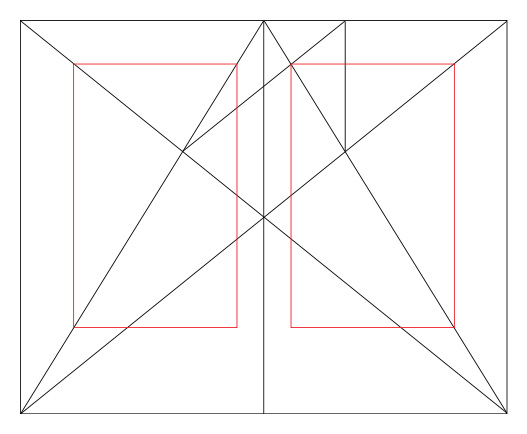 Golden section applied to book proportions, left and right-facing pages. Source: Wikipedia
Continuing with the 16th century inspiration, I fully justified the type, but also adjusted the grid and breakpoints to make sure that the measure mitigates rivers and holes in the text. To emphasize the dense, monolithic effect blackletter texts can impose, I ran the P tags inline and used pilcrows to break each thought, as was the (waning) fashion of that era. Perhaps unsurprisingly, JAF took the time to design a beautiful pilcrow for Herb. As unusual as this reading experience may be at first, the strengths of Herb allow for adapted Renaissance techniques to shine in a responsive environment.
 View the layout, and the grid system.
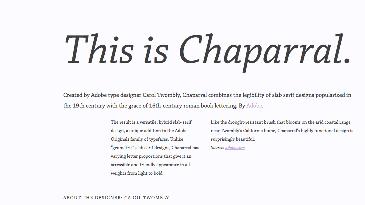
Chaparral
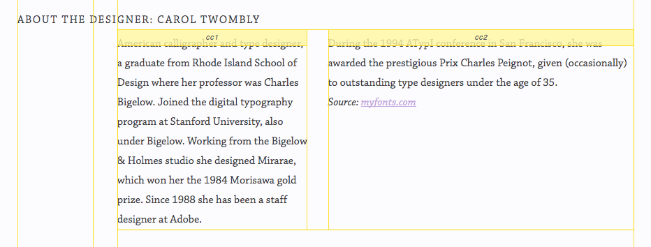
Carol Twombly’s Chaparral is the most capable typeface I’ve worked with on screen, besides maybe Georgia. It is elegant at display sizes, distinct and readable even when tiny, and its italic is stunning. Those chunky semi-slab serifs also make it perfectly suited for backlit, pixel-based displays. Originally released by Adobe in 1997, Chaparral Pro still feels contemporary for web use.
The type
For this composition, I chose to take inspiration from the forms of Chaparral itself; specifically, I measured the proportion of the x-height to the cap-height, which is roughly 66:100. This correlation to the font’s x-height gave me the idea to experiment with CSS’s ex unit. Unlike the em unit, which is defined in CSS by the set font-size only, the ex unit is derived from the x-height of the font (as determined by the browser). Browser rendering of ex sizes is surprisingly consistent, as illustrated in this Codepen example highlighting ex-based line-heights on various fonts. By using the ex unit, I can keep the type size and spacing tied to both the layout and the typeface proportions.
 The cap-height to x-height proportion is roughly 66:100.
The grid system
This grid system was less of a preconceived plan, and more the result of adapting to the needs of the content and composition. To start, I approached the grid system in a similar way to my Herb layout, using the 66:100 ratio to derive a scale for creating both layout and content grids. To create a dynamic, novel layout worthy of showcasing Chaparral, I wanted to push the asymmetrical possibilities of the available space with the arrangement of columns. I revisited the grids numerous times while working on this layout, adapting it as needed to improve the balance of the design and provide enough readable space for the text.
 The resulting layout grid for mid-sized viewports.
The layout
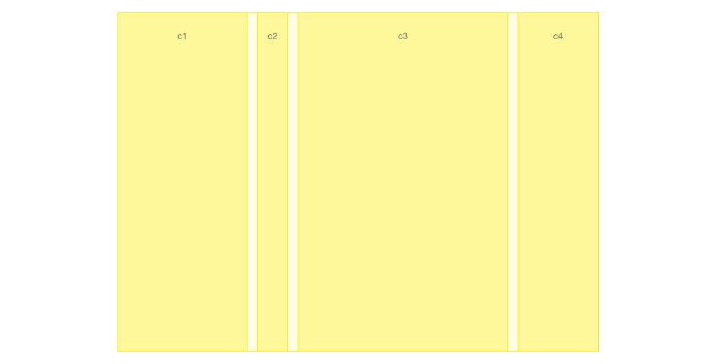
The long, tapered slab-serifs of Chaparral made me think of outdented headers, which grew to be a general theme of creating text overhangs. For a more comfortable measure and efficient use of space on larger screens, I split the body text into two uneven columns, using a short, thin left column paired with a wide right column. This leads to a text shape that again nods to Chaparral’s tapering serifs in the first two sections, and keeps the text comfortably within the height of the viewport for the last.
 The resulting layout grid for mid-sized viewports, showing content.
A foundation in type
By building up from the smallest component of our design — the type itself — we can more fluidly adapt our compositions from the smallest viewports to the largest, giving our content and type priority from the start. Pulling together a layout from the type may not always be practical, but this exercise has shown that on the web, we have unique new space to explore in the connections between layout and typeface, and this is just a start. What type and layout correlations can you find in your next design?
Resources
- http://en.wikipedia.org/wiki/DIN_1451
- https://blog.typekit.com/wp-content/uploads/2014/02/herb.pdf
- http://en.wikipedia.org/wiki/Canons_of_page_construction
- http://www.smithsonianmag.com/arts-culture/the-origin-of-the-pilcrow-aka-the-strange-paragraph-symbol-8610683/
- http://store1.adobe.com/cfusion/store/html/index.cfm?store=OLS-US&event=displayFontPackage&code=1717
One Response
Comments are closed.
Just cannot agree more. This inspires me a lot for coming design projects. Reminds me of basing each design on a concept (the idea) to which all parts are related, big or small.